Creating Charts and Visualisations in Database Assistant
The Database Assistant can create charts and visualizations based on database query results. Visualizations help you explore trends, compare values, and understand patterns in your data more easily. This article explains how to request charts and how to get the most useful visual output.
Written By Kristė Vagnerytė
Last updated 5 months ago
When to Use Charts
Use charts when you want to:
Understand trends over time
Compare values across categories
Identify patterns or anomalies
Present query results visually
Charts are created only when you explicitly ask for them.
Requesting a Chart
By default, the Database Assistant returns answers as text.
To generate a chart, include a clear instruction in your request.
Example request:
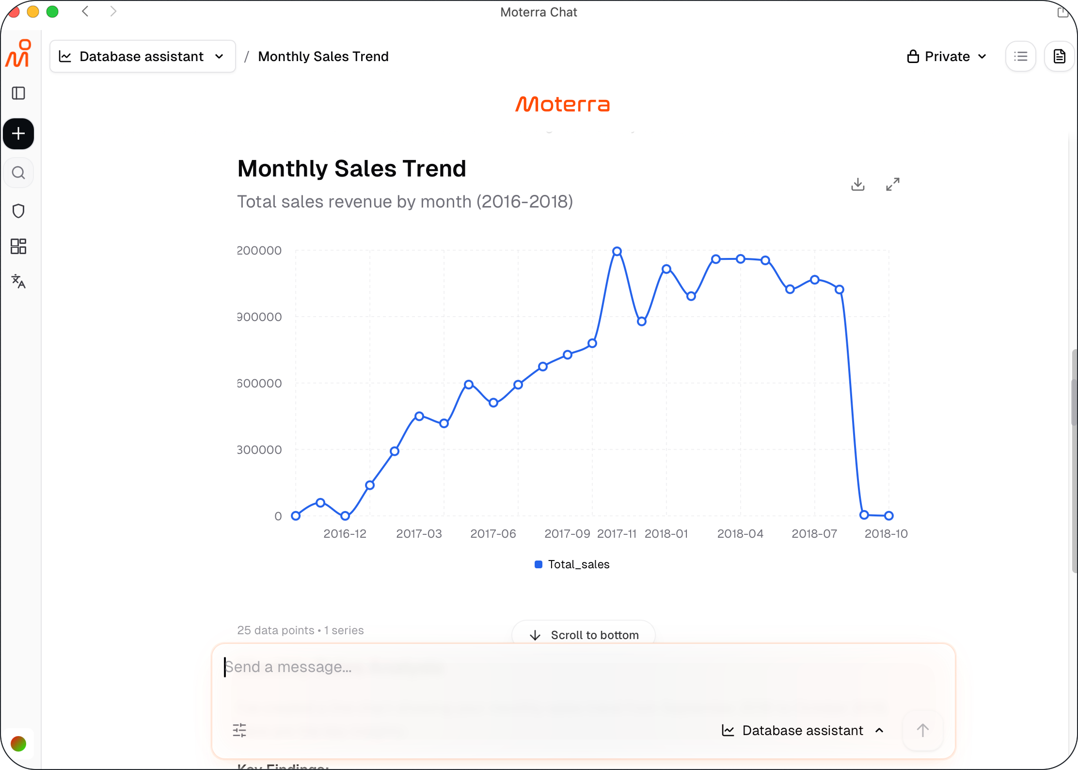
What are our sales by month? Create a line chart.
The assistant runs the query and generates a chart based on the results.
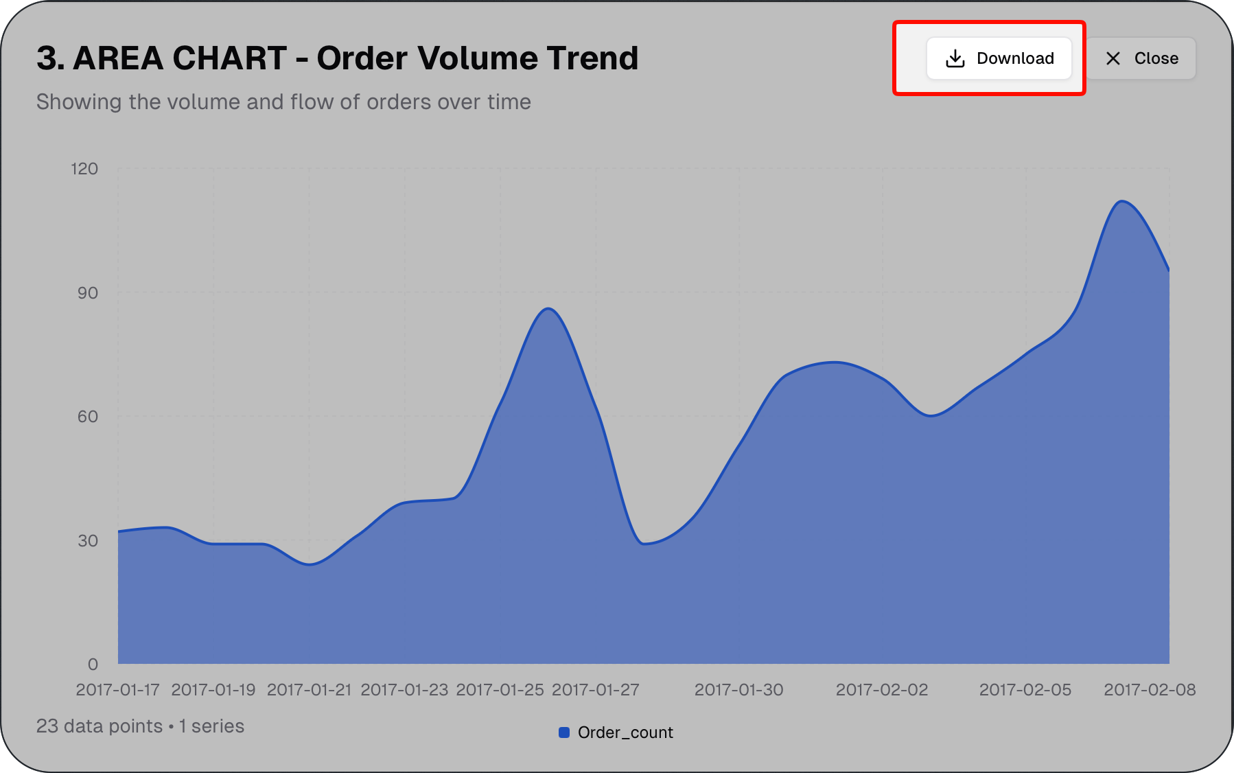
Once a chart is generated, you can download it as a JPG file for use in presentations, reports, or other documents.
Supported Chart Types
The Database Assistant supports common chart types, including:
Line charts – trends over time
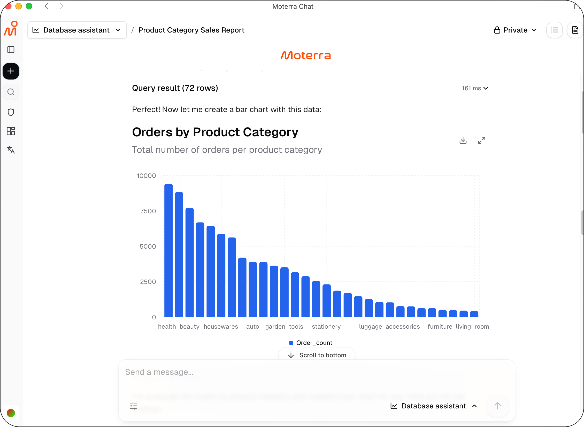
Bar charts – comparisons across categories
Area charts – cumulative trends
Pie charts – proportions
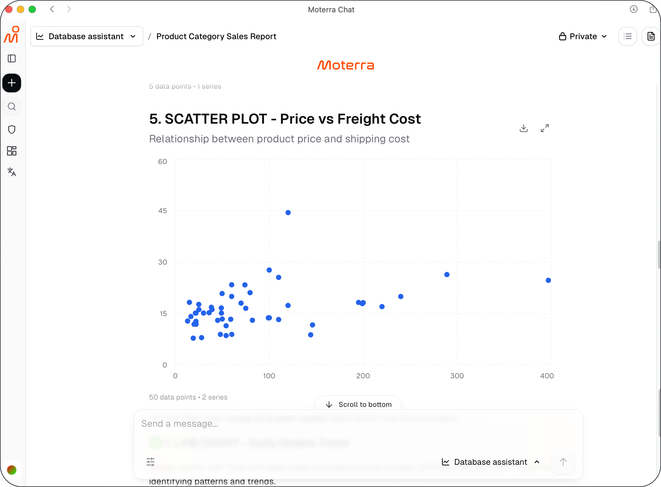
Scatter plots – relationships between variables
Choose the chart type that best fits the question you are asking.
Example: Comparing Categories
Use bar charts or pie charts to compare categories.
Example request:
What portion of total revenue comes from each product category? Create a bar chart.
This helps visualize how different categories contribute to overall results.
Example: Exploring Relationships
Use scatter plots to explore relationships between metrics.
Example request:
Is there a relationship between order value and purchase frequency? Create a scatter plot.
This can help identify correlations or outliers in the data.
Refining Visualizations
If the chart is close but not exactly what you need, you can:
Ask to change the chart type
Request a different grouping or timeframe
Ask for labels or clearer axis descriptions
Refining the request usually produces better visuals.
Best Practices for Visualisations
Ask one question per chart
Choose chart types that match the data
Specify timeframes and groupings clearly
Start with simple charts before adding complexity
These practices help create clearer and more meaningful visuals.